Tuesday, November 19, 2013

Design Thinking in the Content-Areas

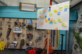
Wednesday, 11/20/2013 at 6pm PST, I will be hosting the weekly #dtk12chat.  I'm hoping to lead a conversation about curriculum-focused design thinking.  That is - design thinking prompts and projects focused on academic content goals.

I feel I've developed some personally solid understanding of design thinking overall, and we have some great babysteps in place incorporating design thinking into things like service learning, classroom spaces, special events... nice school/community projects like that.  Our design thinking committee today even did the d.school Crash Course together, but instead of focusing on "the gift giving experience," teachers redesigned pain points for each other ranging from aspects of our student applicant visits to classroom transitions to course reflections.  I'm not saying we're experts, but we're well on our way towards deep implementation of these ideas at a sort of systemic level!  (*pats self and colleagues on back*)

Yes, and...

I'm still not sure how to apply design thinking *in my science classroom!*

I've long been a proponent of project-based learning (PBL). I'm super excited about #makered, and my kids have been building and engineering towards academic purposes since I started teaching. (Couple of serious throw-back links in there...)  And I will continue using project-based learning, engineering, and "making" in my classroom while incorporating babysteps of design thinking, through bits and pieces of awesome new brainstorming/ideation techniques, fabulous positive critical feedback scaffolds, and structures for iterations that I've been learning while learning about design thinking.

Yes, and...

What does fully-fledged design thinking look like in the content context?  How do I create a design thinking prompt that will also lead students towards critical content understanding?

The critical jump from engineering-design PBL to Design Thinking seems to be empathy... My students can learn excellent content through a project to design and build a boat that will hold X weight and travel Y distance, but does the user matter in that case?  My colleague Santosh is leading a fabulous design engineering exercise right now in which kids are designing devices to burn a chip and measure the heat produced... it can't be "design thinking" because there's no user for whom to probe needs, right?

Now, I'm not saying that every single project *must* be design thinking!  I'm wondering... how and where can I bring more empathy into my content-focused courses, and create prompts and scaffold experiences that go deeply into design thinking like those service learning design projects and classroom environment re-design projects that we're diving into?

For example:

  • Kim Saxe describes this incredible project in 6th grade Health classes that involve redesigning aspects of health care experiences.
  • St. Marten's Episcopal in New Orleans just posted to #dtk12chat this beautiful Spanish class design thinking content project in which students are investigating illegal organ trade.
  • Heather Pang's incredible monuments-to-great-American-women project has many beautiful elements of design thinking for her social studies content (although I don't know if Heather herself would call it design thinking.)
  • An awesome physical education teacher I met this weekend at EdCampPSWA (Puget Sound Washington) has a new plan to have his students create healthy-for-life exercise games with MakeyMakey as final projects.
  • Project Ventura at Ann Richards School for Young Women Leaders is an incredible ongoing engineering design project with clear end users - definitely design thinking, though I don't think I've ever heard them define it as design thinking.

So, in tomorrow's #dtk12chat, I'm hoping to collaborate with other participants to pull out (1) how we're already using elements of design thinking in our academic content-focused pursuits, (2) examples of fully-fledged deep design thinking projects in those areas, and (3) maybe piece together some philosophies and tips for developing new prompts to support more design thinking in the content areas.

Yep, that's the idea.  We'll see how it goes...

Friday, November 8, 2013

School Make/Innovation Spaces

(Edit June 2014: I visited two more school make/innovation spaces and blogged those findings here.)
(Edit March 2015: Three more blogged here.)

Last week, after FabLearn and visiting the d.school, I visited 4 schools and their innovation spaces with my head of school and two of our board trustees, and we learned a TON more about how different spaces work for children and adults to develop their innovative thinking and crafting/construction skills.  Here are some of my findings.

(Click on images for much larger views.)

Overall organization
Furniture
Student Projects
Fun Toys


Overall organization:

Large, clear rooms but with the opportunity for division into smaller rooms.  In the pictures below, notice *every* space has extendable electrical outlets from the ceiling and tables on wheels.  Concrete floors and minimalist seating... stools.

 
Menlo School (left) and Nueva School (right)

Castilleja School

Large glass walls separated the smaller spaces well.  Menlo School's space-separating walls were permanent, with smaller doors.  Nueva School's walls were translucent - and beautiful/colorful! - and not attached to the ground (hanging), so didn't have sound-damping effects between the rooms (a *con* for those types of diving walls!).  Castilleja School's walls had very large sliding glass doorways, and good sound damping since they slide at both top and bottom.

Menlo (left), Nueva (center), and Castilleja (right)


Parts and tool organization was also very consistent.  Small bins all stored near each other, easily removeable to be brought over to work space as needed.  Also, slatwalls at Castilleja and Nueva for easily popping in and out hooks for tools and bins for small parts.

Both Castilleja School

Nueva School

Both Menlo School


As mentioned above, all of the schools' tables were on wheels, but the tables have very different hefts and maneuverability, as well as serve different age ranges!

Menlo's tables were smaller and more light-weight, although with larger surface area than the original d.school design.  They are intended to be student-specific, so each student or pair have their own space for a project that can be moved around to reach different tools throughout the space.  They've found that this moveability feature isn't used as much as expected, but is increasing as kids develop better habits in the space.  I *love* the idea of having enough tables that projects can be kept in situ throughout the process, but that requires an awful lots of space and tables.  This seems to work quite well for their high-school aged population.

(Both images from Menlo School)


Nueva's tables are much larger and intended for larger groups.  Their students have more difficulty maneuvering the tables, which I would guess is heavily due to the fact that their population ranges all the way down to kindergarteners.  While the tables *can* move, that functionality is not used much by the children.  They are at a height that works well for their full age-range, which is a big feat!

(Nueva School)


Finally, Castilleja's tables are quite a bit taller (more like bar-height than table-height), with a bottom shelf for short-term project storage.  With a space with less square-footage, they have fewer tables.  Castilleja's students move the tables easily for space reconfiguration, which makes sense given a middle- and high-school population.

(Castilleja School)


Castilleja, Nueva, and the teacher innovation space at Los Altos School District all made use of the awesome z-rack walls highlighted in d.school's MakeSpace Book.  I think these are a clear need for any flexible-use space!  LASD also had larger-framed folding/rolling white board walls that are more difficult to maneuver than the z-rack walls and don't offer the same level of flexible space division.

Castilleja (left), Los Altos SD (center, showing both types of dividing walls), and d.school (right)


(None of these sites had the awesome flip-top tables like at Hillbrook School's iLab or in Quest Academy's MakerSpace.  I'm very interested in doing something like that, although they're certainly not as *sturdy* as the big block tables.  Whiteboards that can be walls or tables?  Pretty cool...)


Ultimately, our maker/innovation spaces are all about the kids and the incredible thinking and skills that can be achieved through hands-on self-driven activities, persistence, iteration, and connections.  I just got a couple images of student projects, but they say a LOT about the incredible learning happening in these spaces.

Castilleja School's Angi Chau and Heather Pang collaborated
for 7th grade humanities students to design and build 
scale models of monuments to great American women.


Menlo School's Joanie Banks-Hunt supports her engineering students 
in creating their own electromagnetic motors using self-built and 3D-printed parts, 
as well as in designing and building gear/cam toys using laser-cut components.


LASD's current space is organized for teacher innovation (as opposed to 
student building), and their set-up is clearly leading to 
some great thinking, planning, and innovative implementation in their district.  
Evidence: these incredible thought boards.


While at each school (and at FabLearn), I also learned about a few fun toys to add to our repertoire...

Foam Cutters!  I had no idea...

Cubelets! Expensive, but REALLY fun.

Cheap-and-easy whiteboard tables... Showerboard!

At the FabLearn Demo: Programmable Batteries.  Not yet available commercially.

Also at the FabLearn Demo: Tangles.  Convert any 3D object 
into a puzzle made of standardized pieces.  
Either Laser Cut or just use Magnatiles!


If you made it this far, and you want to do even more thinking about awesome student-driven "making" in schools, I highly recommend Vinnie Vronty and Sheryl Peterson's video on the development of Quest Academy's makerspace and maker culture.  As they say in the video, you can't build the space without building the culture and pedagogy in with it.

And join the conversations on twitter at #makered and #dtk12chat !


Monday, October 28, 2013

A Visit to the D.School

While attending FabLearn this weekend, I got to peek into the D.School's space on both Saturday and Monday, and took a TON of pictures to document the incredible space organization - to bring back to my own school as we rethink our classrooms and prepare to build an incredible new innovation space.  Here's what I found:

Flexible, comfortable space:

The giant atrium, former-alley-between-two-buildings that serves as a common space.
This is where the d.school crash course video was filmed!

Note the glass garage door to allow the space to really open up when needed.

These flexible seating benches / work tables have portable hard surfaces.
Comfy for sitting or firm for writing / laptopping.

These rolling mini-couches were plopped all around the main floor.


Well-organized public work stations:


These work stations are essentially x-channel racks 
with electrical outlets and mini-tables...
Perfect for a quick work session, finishing up 
homework, spontaneous conversations.


Group Project Spaces:

White board mini-walls suspended on tracks

LOTS of white boards!

On the other side of the walkway, smaller more-enclosed flexible work spaces.


"The Makery:


Examples of items from the MakeSpaceBook:

Pop-up wall blocks.

Z-rail white board walls

Rolling bar-height tables and cube stools

White boards hung on the wall, posts, everywhere!


Sunday, October 27, 2013

Engaging Activities for the "I'm Not Really Into Tech" Kids (And Adults!)

Today was the incredible first day of FabLearn 2013, the third Digital Fabrication in Education Conference at Stanford.  I'll have to do a full-day reflection in another post, because a full debrief of my workshop - Flashy Fashion: Engaging Activities for the "I'm Not Really Into Tech" Kids - is in order!

All laid out, ready to go!

Session Intro / Context Setting
Understanding the Audience
Gettin' To Work!
Mistakes = Learning Opportunities
Final Products!
Activity Materials List / Sources


The session was in the afternoon, and started with quite a light crowd... about 15 participants.  I began setting the stage by describing the context of my awesome school and how our "Maker" / Innovation / FabLab / Design Thinking program is underway.

Intro
We have had some interesting jumps along the way that have guided the goals of our program, including an unintended but firmly established culture of using glue guns for EVERYTHING, and a strong divide between the "Tech is AWESOME!" kids and the "I'm just not a tech person..." kids.  Noticing this divide is what really prompted my wonderful colleague Shaye' and I to develop and implement our "Wired For Art" course - to begin to show that technology-driven art and engineering needn't be limited to kids who have already established expertise and comfort in programming and robotics.

Thus, these activities: designing and creating one's own cute, fancy, flashy, geeky, fun accessories and crafts, learning and applying basic electronics circuitry along the way.  I prepared to give the workshop participants my big prompt:  Set aside your understanding of circuitry, and think from a kid's point-of-view.  From your playtime with MakeyMakey, you know only that a circuit has to be closed - there must be a loop for electricity to flow from one side of the battery around to the other, and hopefully you'll pass through some LEDs along the way to make them light up.

Understanding the Audience
It was really at this point that I realized that the fabulous, enthusiastic, inquisitive participants in my workshop actually wouldn't need to put on artificial student hats!  I had a couple questions I asked to gauge just how much setting-aside the crowd would need to do:
- How many of you can read a resistor without using a key? (answer: none, and one "there are people who can do that?)
- How many of you can spot why this student design idea won't work on first try? (answer: none)

"Oh, hey wait..." I said.  "This is actually a bit different from the workshop I was planning to lead..."

So, rather than jumping straight to the prompt, I pulled everyone to the tabled in the back of the room to introduce them to our materials.  I introduced our conductive thread, coin batteries and battery holders, and LEDs.  I still wasn't going to give them more info than I gave my students, and was actually pretty excited to support some fabrication-in-education enthusiastic adults in their first forays into basic circuitry!

Gettin' to Work!
After that introduction, THEN the prompt:  Create something cool!  I recommended starting with a simple wrist cuff - as I recommended to my own students - and using a snap as a switch to be able to open the cuff / open the circuit / turn off the LED.  Draw the sketch out on a piece of paper first, then grab materials and get to work!

Here are some of my participants hard at work:


Mistakes = Learning Opportunities
They ran into THE EXACT SAME CHALLENGES that my students ran into!
- running a single piece of thread across the whole circuit, shorting across the LEDs
- only connecting one side of an element - like the battery - to the circuit
- reversing the LED leads!
- tying the battery holder in such that the thread shorts between the positive and negative side
- including too many LEDs in a series circuit, with too much voltage drop to light the LEDs
- craftsman ship matters! loose, dangly threads lead to shorts or disconnects

(BTW, there are several ways to attach LED leads into your conductive thread circuit... My favorites are (1) bending the leads into loops and tying thread into the loops, or (2) folding the leads in half and looping thread through the half AND sewing around the folded lead to hold it steadily in place.)

Each of these cases opened a great opportunity for deeper learning about circuit design, including several people who ended up making parallel circuits instead to be able to light three or more LEDs with our teeny 3V batteries.

Final Products!
The session, of course, went a tad long... Everyone HAD to finish their creations!  (Andrea even finished hers during the final panel of the day, and found me to snag her picture afterwards!)  Here are a few of their proud, happy faces with their awesome LED accessories:


(Yes, that's an octopus - quadropus? - hugging a smart phone...)


Materials List / Sources

(edit: Did you land here looking for the June 2014 Design, Do, Discover page? It's here.)

You can put together a whole kit for several classes for a little more than $100!  I've had several requests for info for my materials sources, since I've managed to find my way around digikey.com, so here they are!

- lithium ion coin batteries (digikey)
- coin battery holders (digikey - these are not "sewable" and you have to use needle-nose pliers to bend the surface mount components to render them "sewable."  But MUCH cheaper)
- simple, low voltage red LEDs (digikey)
- simple, low voltage green LEDs (digikey)
- conductive thread (sparkfun)
- packs of felt (Jo-Ann Fabrics)
- packs of needles (Jo-Ann Fabrics)
- some colorful thread for decoration (Jo-Ann Fabrics)
- sewable snaps (Jo-Ann Fabrics)
- scissors
- needle-nose pliers for bending battery holder leads and LED leads (Jo-Ann or wherever)